The Psychology of Shape: What Circles, Squares, and Triangles Tell Your Audience
Before a viewer reads a single letter of your brand name, before they register your colors or judge your typeface, they have already absorbed something from your logo. They have felt its shape. This happens in a fraction of a second, far below conscious thought, and it quietly colors everything they go on to feel about your brand. A logo built on a circle whispers something fundamentally different from one built on a sharp triangle, and the most effective designers treat that difference not as decoration but as the foundation of the entire message. Shape is the grammar beneath the words.
The reason shapes carry meaning at all is that our brains are pattern-reading machines, shaped by a long history of needing to interpret the physical world quickly. Soft, rounded forms in nature tend to be safe: a pebble, a fruit, a curled animal at rest. Sharp, angular forms tend to signal caution: thorns, teeth, the edge of a cliff. Long before anyone designed a logo, the human mind learned to attach emotion to geometry, and that ancient wiring is exactly what a brand mark borrows from. When you choose a base shape, you are not picking a neutral container. You are choosing a feeling that arrives before any rational thought does.
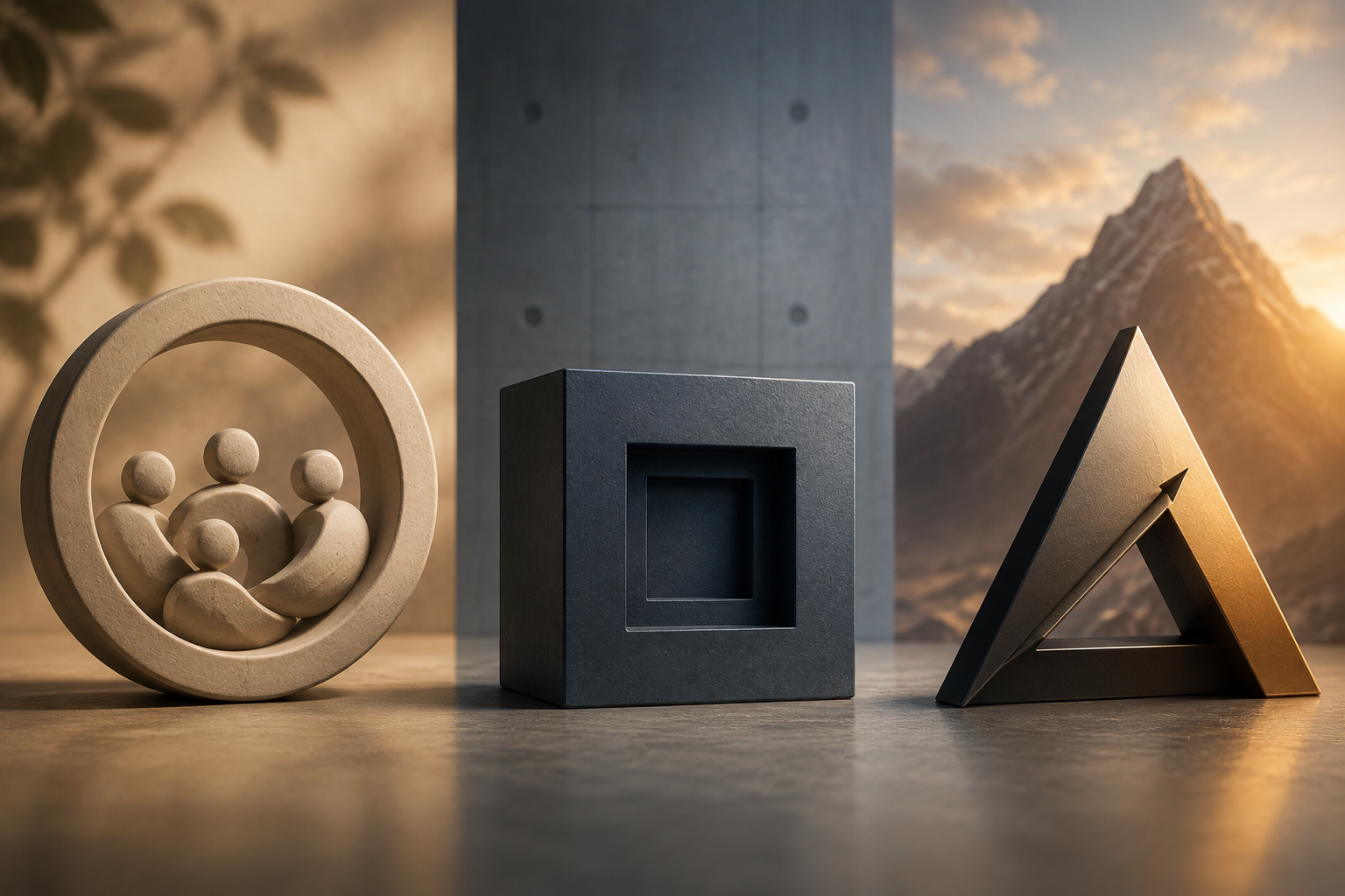
Consider the circle first, because it is perhaps the most emotionally generous shape available. Circles have no beginning and no end, no hard edges to stop the eye, and that endlessness reads as unity, wholeness, and continuity. A ring suggests a community, a cycle, a sense of completeness and protection. Because the form curves back on itself, it feels inclusive and welcoming rather than confrontational. This is why so many brands that want to seem friendly, communal, or trustworthy reach for circular marks, and why anything meant to evoke togetherness, from cooperatives to global initiatives, so often lives inside a ring. The circle also carries a softer, more feminine, more harmonious connotation in most viewers' eyes. It says, in effect, you are safe here, you belong. The trade-off is that pure roundness can feel gentle to the point of being unassertive, which is wonderful for a wellness brand and wrong for one that wants to project hard-edged authority.
The square, and the rectangle that extends from it, speaks an entirely different language. Where the circle flows, the square sits. Its four equal sides and right angles read as stability, balance, and order. A square feels planted, dependable, and rational, like a building with a solid foundation or a sealed box you can trust to hold its contents. This is the shape of institutions that want you to believe in their permanence and competence, which is why banks, technology firms, and established corporations gravitate toward squared and rectangular forms. The straight lines suggest discipline and structure; the symmetry suggests fairness and reliability. The square is the visual equivalent of a firm handshake. Its weakness is the flip side of its strength: taken too literally, a square can feel rigid, conventional, even dull, signaling so much stability that it tips into the unimaginative. Designers often soften a square's corners slightly precisely to keep the reassurance while shedding a little of the stiffness.
Then there is the triangle, the most dynamic and most charged of the three. A triangle has direction. It points. That single quality changes everything, because a shape with a clear vector implies movement, progress, and purpose, an arrow toward a goal. Pointed upward, a triangle feels stable and aspirational, like a mountain or a pyramid, conveying ambition, power, and the drive to climb. This is why so many brands built around energy, leadership, and forward motion lean on triangular forms. But the triangle is also the shape of tension. Its sharp angles carry an edge of energy and even aggression, a sense of conflict or risk that the circle entirely lacks. Point it downward and it can feel unstable, precarious, on the verge of toppling, a quality a clever designer can use deliberately to signal disruption. The triangle, in short, is the shape you choose when you want to feel less like a safe harbor and more like a force going somewhere.
What makes this genuinely useful is not memorizing a fixed dictionary of meanings but understanding that these associations combine and bend with context. The same triangle reads as a serene mountain in one logo and a warning sign in another, depending on the color wrapped around it, the typeface beside it, and the angle at which it sits. Shapes do not work in isolation; they set a baseline emotion that every other design choice then tunes. A rounded, friendly base softened further by a warm color and a handwritten script becomes unmistakably approachable. The same circle rendered in cold steel gray with a stark geometric font reads as precise and corporate instead. The shape supplies the underlying mood, and the rest of the design either deepens it or complicates it on purpose.
The practical lesson for anyone building a brand mark is to begin with intention rather than instinct. Ask what your brand most needs to make a stranger feel in that first wordless instant. If the answer is trust and community, the geometry of the circle is already working for you. If it is solidity and authority, the square is your ally. If it is ambition, momentum, and a little edge, the triangle will carry that charge. The shape you choose is not a frame around your message. It is the first and quietest sentence your brand ever speaks, and your audience hears it long before they know they are listening.